We use cookies to improve our services and remember your choices for future visits. For more information see our Privacy Policy and Terms of Use.
Independent, Reader-Supported Publishing
History
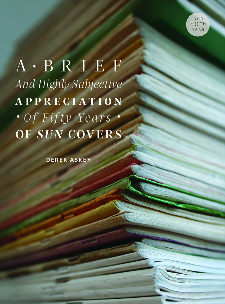
A Brief and Highly Subjective Appreciation of Fifty Years of Sun Covers
I ’ll be the first to admit, I’m something of a fetishist for the past. I studied history in college. I know my parents’ wedding album probably better than they do. Though by no means exclusively, I listen to a lot of old music. As I write, I’m playing 1968’s The Kinks Are the Village Green Preservation Society — itself an expression of nostalgia for an earlier time.
One history that especially fascinates me is The Sun’s. On the wall of my office is a calendar the magazine sent to subscribers — all forty or so of them — at the beginning of 1977. It’s outdated and nonfunctional, but I hung it there because of its . . . well, grooviness. I like the horoscope-adjacent artwork and the handmade feel. It’s very much a product of its time, the kind of thing my brother would call “crunchy.” It is, I’m somewhat embarrassed to admit, one of several outdated calendars that take up space on my walls.
While working at The Sun for the past eight years, I’ve had many opportunities to pore over past issues. (That’s how I found the calendar.) When I started, we hadn’t yet made our archives available on our website, so I’d pull out binders and thumb through the printed copies — the rust from the old binding staples leaching into the pages, the paper as yellowed as a long-expired library card. I’d spread a stack across my desk like a kid going through his comic-book collection. The musty, generically old smell of them was not unlike my parents’ wedding album.
It was an education in where The Sun had been. Seeing what filled the magazine in, say, 1984 — the year I was born — was illuminating. I got a sense of the readership through the types of businesses that chose to buy advertising back before we stopped carrying ads: natural grocers, places that sold crystals, and something called Earth Shoes. Pretty crunchy. But I was especially interested in the covers. In the earliest issues the cover was simply a sketch by Sun cofounder Mike Mathers. Often politically charged, but also kind of funny — a combination that seems to me somehow tied to the seventies — the covers conveyed an irreverent, handcrafted tone. You knew there was creativity here, an original point of view, a hard-to-pin-down drive. Surely it was worth the fifty-cent asking price.
For the earliest issues the cover is simply a sketch by Sun cofounder Mike Mathers related to the issue theme. The September 1974 issue theme is “The Chapel Hill Experience.”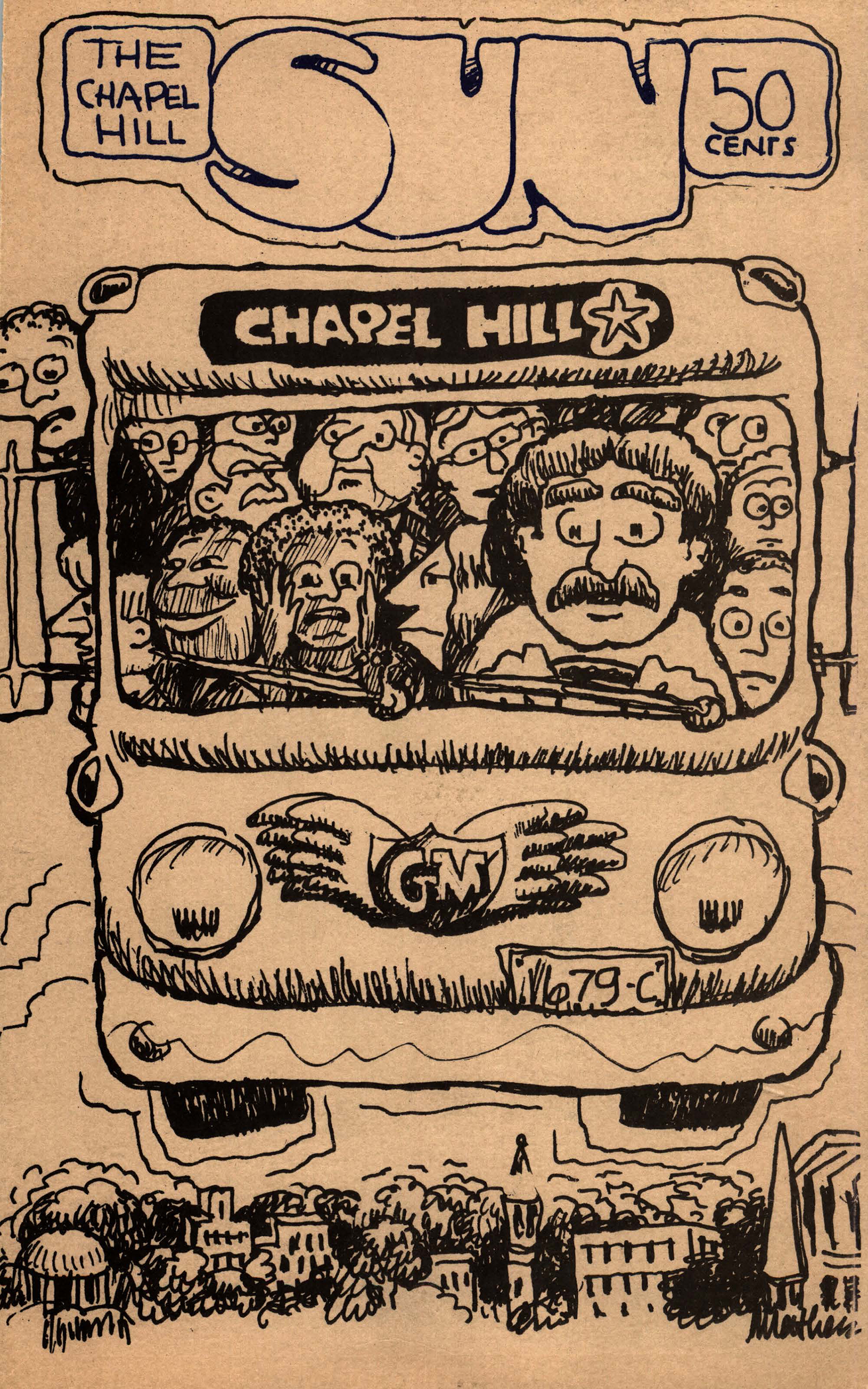
It wasn’t long, however, before The Sun began using the now-familiar sun-with-a-monocle logo and standardized typography for the title. It had also begun calling itself a “magazine of ideas.” (In a letter to the editor, which never fails to make me laugh, reader Brian Knave asked, “Shouldn’t a ‘magazine of ideas’ have as many good ideas as bad?”) And the covers became more varied, more adventurous and even whimsical. I like to envision the meetings where founder and editor Sy Safransky gave the thumbs-up to using a picture of a scowling woman in a headscarf on an issue about “feeling good” (September 1975); or a garish cartoon of a car with a ghost (?) of a woman caught in its grille (November 1975); or a haunting two-color image of a child with her hand raised, framed by a decrepit-looking window (March 1977). What was in the air, aside from cannabis smoke, that influenced those choices? How do I square the Sy I know now — quiet, wise, careful — with the thirty-something hippie who put out this magazine?
The theme of the September 1975 issue is “Feeling Good,” and its cover features the photo of a scowling woman in a headscarf. This is the first appearance of Tom Cleveland’s now-familiar sun-with-a-monocle illustration as the magazine’s logo on the front cover. The back cover describes The Sun as a “magazine of ideas”: “Those of you who knew The Sun in its first days of publication appreciate how much it’s changed. That change is a measure of our common evolution. A magazine of ideas is only as sophisticated as those who write for it, and read it. . . . Thanks to the talented writers and artists who’ve shared our vision, The Sun — pubescent still — is growing up.”
In November 1975 The Sun introduces itself as a “Magazine of Ideas” on the front cover. The cover illustration by Frank Holyfield — entitled “Buick Gives You Something to Believe in but Plymouth Makes It” — is a garish cartoon of a car with a ghost of a woman caught in its grille for an issue with “Women” as its theme. Holyfield said that his drawings in the issue are “autobiographical.”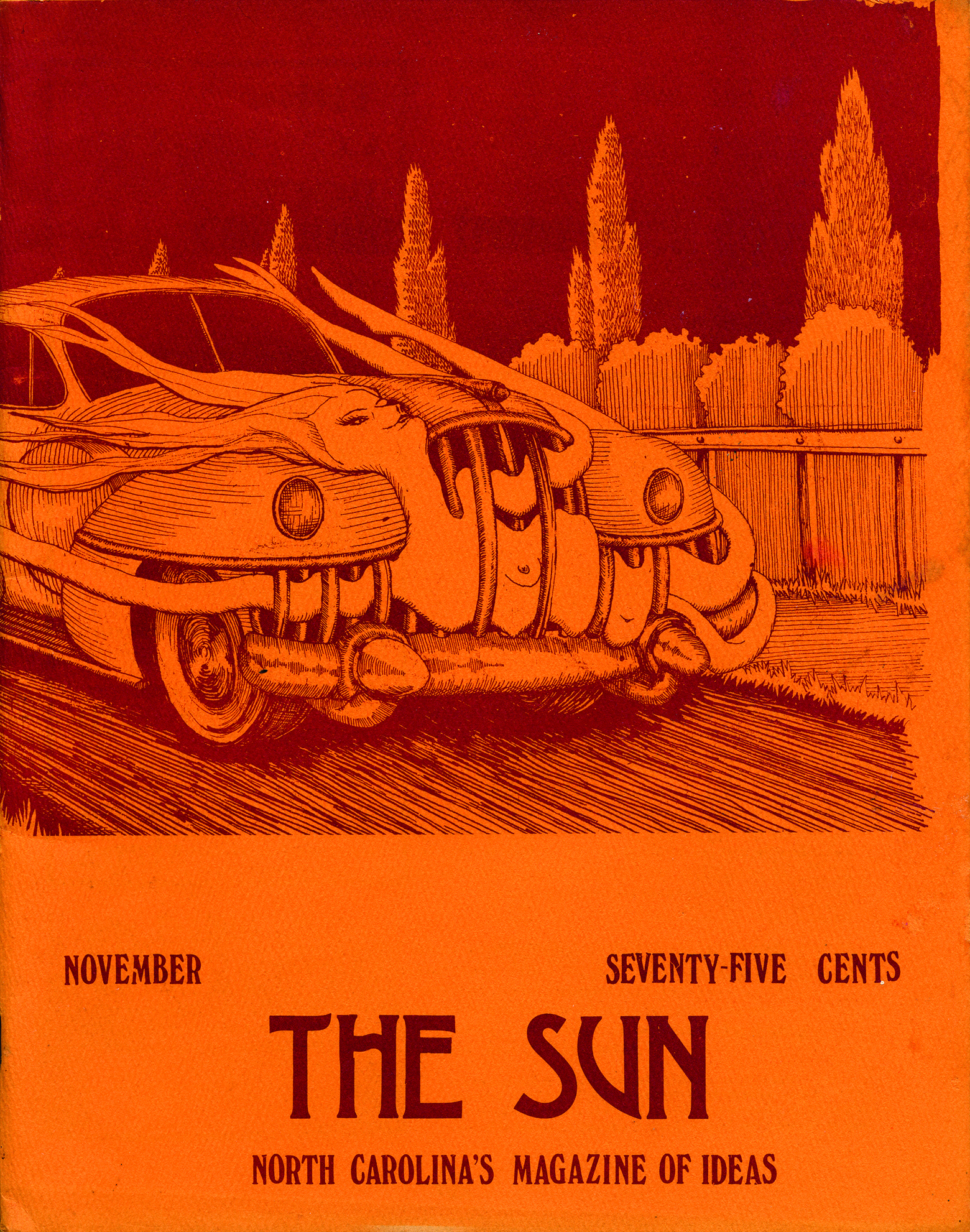
The March 1977 issue cover features a haunting two-color image by Darryl Wally of a child with her hand raised, framed by a decrepit-looking window.
As The Sun moved into the eighties, the aesthetic culture of the seventies still clung to it, a phase not fully outgrown. When we envision the 1980s, most of us probably picture Steven Spielberg movies or big hair, yet on the cover of The Sun we’ve still got Pete Seeger (May 1981), Allen Ginsberg (April 1982), or a woman in drapey garb sitting in a crescent moon (October 1983). Much like the past extends to our present, so, too, did it do so in the past. I love that. But John Rosenthal’s marvelous photograph of a snowy park from our January 1985 issue would fit right in on next month’s cover. The photos, presented inside a border of color then, are occasionally surreal, but more often they are, like the magazine then and now, personal: smiling faces, a hallway, a dude “playing” a broom like a guitar, a teacup catching a slant of sunlight.
The May 1981 issue cover photo by Charles Porter is of folksinger and activist Pete Seeger, who was interviewed by then–editorial assistant Howard Rubin for the issue. Rubin will go on to do nearly thirty interviews for the magazine, but this was his first. One of the most appreciated folksingers of all time, Pete Seeger was also a familiar figure in the civil rights, peace, and environmental movements. He wrote songs such as “Where Have All the Flowers Gone,” “Turn, Turn, Turn,” and “If I Had a Hammer.” Rubin describes Seeger as “the archetypal folksinger with his greying beard, his raspy, sincere voice, and his old banjo with the words ‘This machine surrounds hate and forces it to surrender’ emblazoned on it.”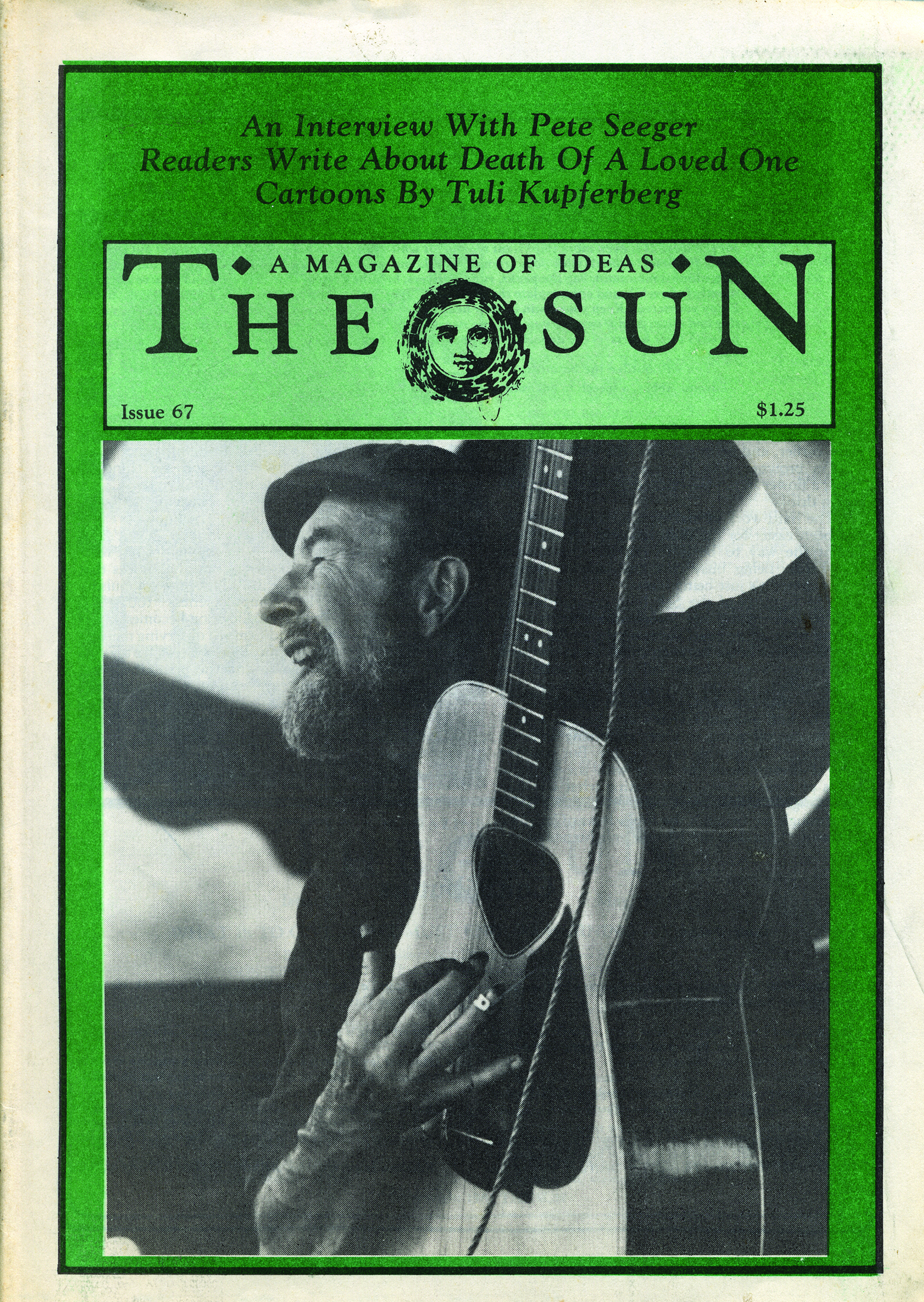
The April 1982 issue cover photo of poet and writer Allen Ginsberg was taken during his interview for the issue with then–editorial assistant Howard Rubin by Howard’s dad, Jerome Rubin. They met Ginsberg at the old apartment that he kept for New York visits. When they arrived they yelled up for him; the buzzer had been broken for years. Ginsberg had always lived in relative poverty, giving extra money away, usually to young poets. In the interview Rubin writes, “Allen Ginsberg gave a reading of Howl in New York recently, the first in more than a decade. It was his first great work, as resonant today as in that famous first reading in 1956, when it vocalized the birth pangs of the Beat generation.”
The October 1983 issue cover image is of a woman in drapey garb sitting in a crescent moon.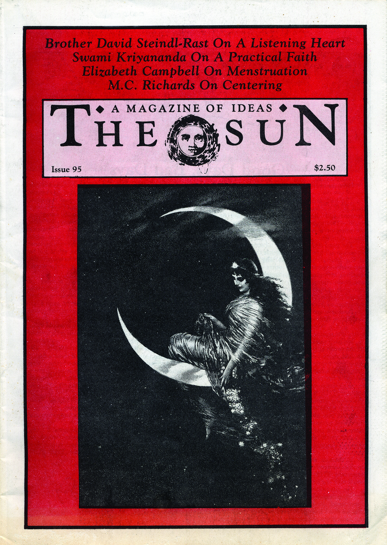
The January 1985 issue cover features John Rosenthal’s marvelous photograph of a snowy park.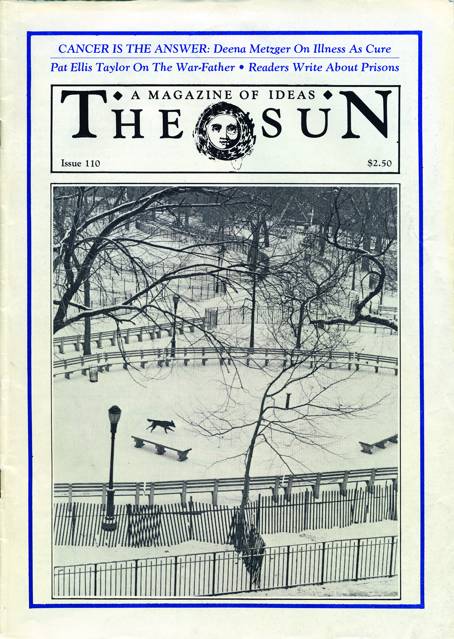
The nineties moved the cover closer to the version you now hold in your hands. It would be easy to lament the loss of the quirky older covers if the new ones weren’t so damn beautiful. The borders are still there, and the colors have gotten visibly more nineties: the sort of pastels and milky blues and forest greens you might find on tents and backpacks. But it’s the photos that really sparkle: Sandro Michahelles’s joyous shot of men at a dinner (June 1998), or Jason Langer’s charming image of a pair of legs jumping over a field of flowers (April 1994), or Rita Bernstein’s candid photo of a young boy daydreaming on a porch (January 1997).
The June 1998 issue cover features Sandro Michahelles’s joyous shot of men at a dinner.
The April 1994 issue cover features Jason Langer’s charming image of a pair of legs jumping over a field of flowers.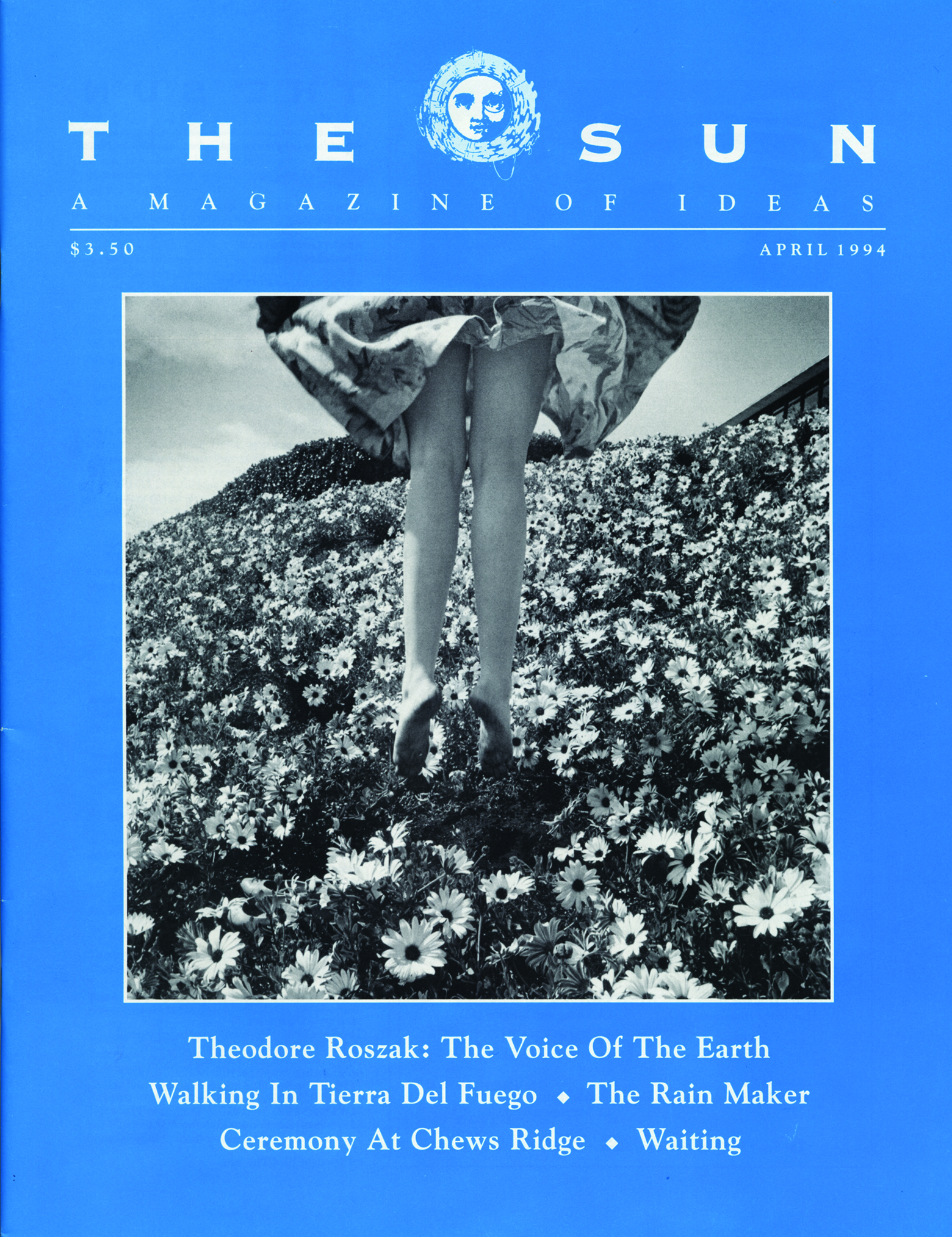
The January 1997 issue cover features Rita Bernstein’s candid photo of a young boy daydreaming on a porch.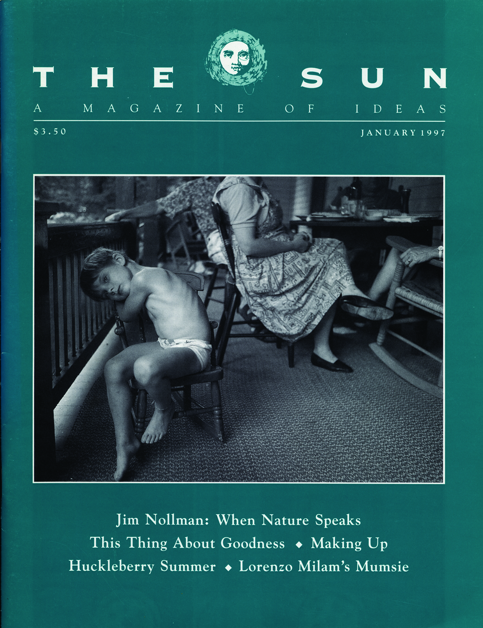
It’s also, as my colleague Molly likes to point out, our “statue era,” where, for some reason, we printed a lot of photos of statues on the cover. And though the magazine is a little more buttoned up, it’s still unpredictable. An extreme close-up of a baby’s face, taken by William Carter, is one of my favorites (March 1998). Jerry N. Uelsmann’s “photomontage” of a pair of open palms, one holding a cloud while the other holds a window with bars over it (December 1998), feels like a callback to 1981. The Sun might have had more subscribers, and its sensibilities might have matured, but you knew it wasn’t Time or Newsweek.
The March 1998 issue cover features a photo by William Carter of an extreme close-up of a baby’s face.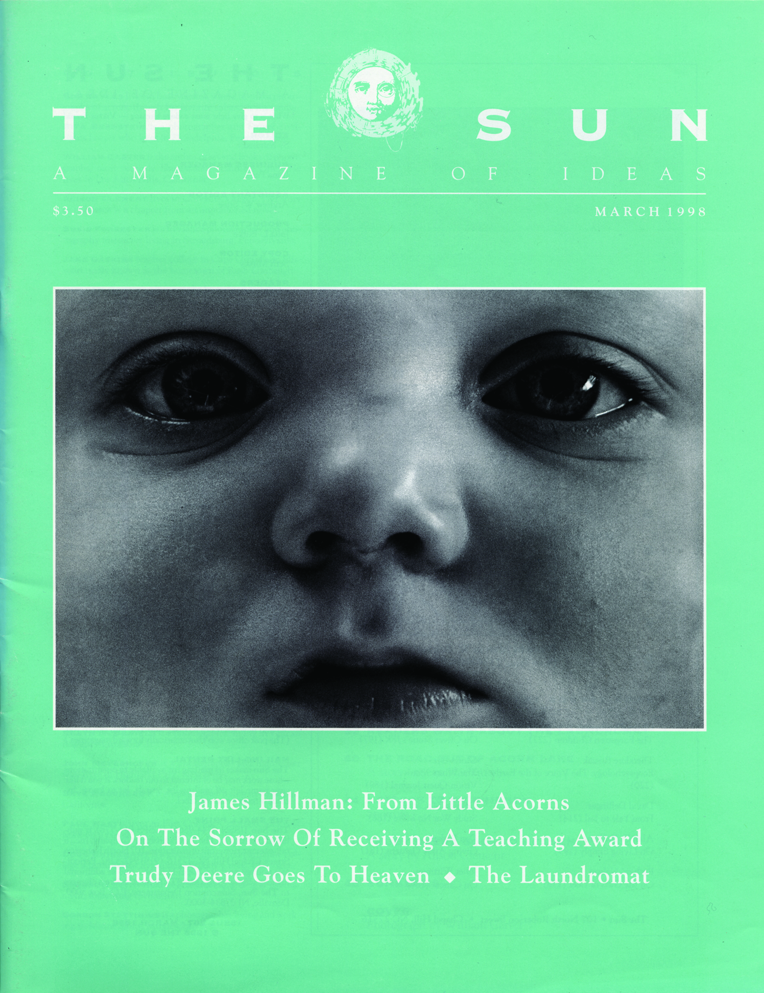
The December 1998 issue cover featuring Jerry N. Uelsmann’s “photomontage” of a pair of open palms, one holding a cloud while the other holds a window with bars over it, feels like a callback to 1981.
By 1999 the magazine had adopted the cover format you see today, which for me has always called to mind Life magazine covers from the twentieth century, though I don’t imagine that’s what then–art director Julie Burke was trying to emulate. It’s a sturdy format with room for endless reinvention, which I suppose is why we’ve stuck with it so long. One of my favorite covers from this century was on an issue we released after the terrorist attacks of 9/11: the upper-left logo was black, and the cover photo wrapped around to the back, turning a portrait of the Statue of Liberty, by Marco Castro, into a landscape (November 2001). The cover is a great argument for the continued power of print media to say something extraordinary. Something catches in my throat every time I look at it.
Released after the terrorist attacks of 9/11, the November 2001 issue features a black logo and its cover photo wraps around to the back, turning a portrait of the Statue of Liberty, by Marco Castro, into a landscape.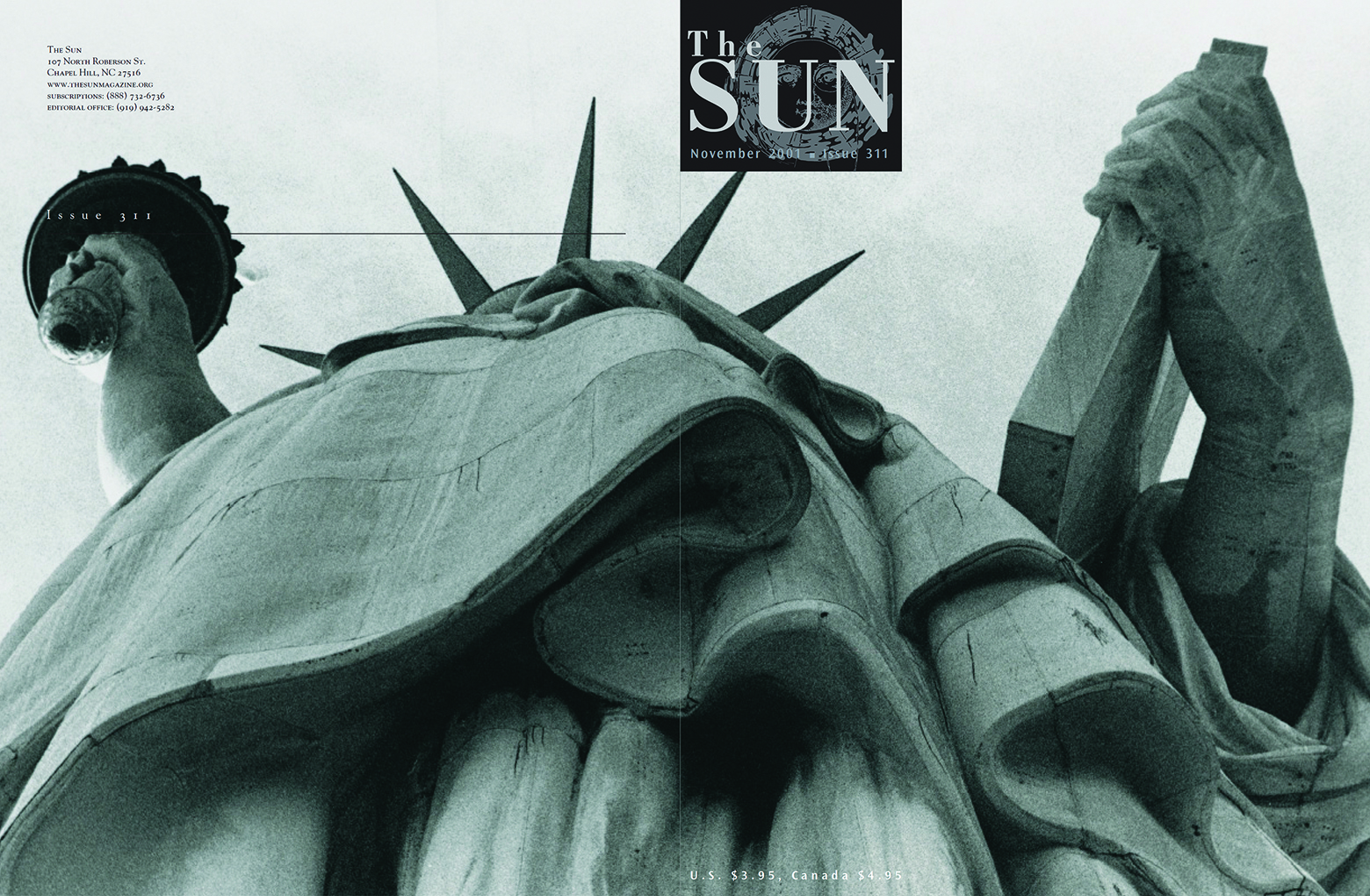
It’s probably for the best that I wasn’t around as the magazine moved from one cover design to the next. I might have been scowling in the corner, arguing that there ain’t nothing wrong with the one we had. (I blame my dad for making that phrase a part of my vocabulary.) But I know as well as anyone that these changes needed to happen in order for the magazine to evolve and grow and reach new readers. And I still have these old issues to go back to — easily done nowadays on our website, where subscribers can experience the contents, if not the musty smell, of every issue. I encourage you to revisit The Sun’s imperfect, exhilarating, crunchy history. “People often change,” the Kinks’ Ray Davies sings on Village Green Preservation Society, “but memories of people can remain.” So, too, of a magazine.
— Derek Askey, Associate Editor
Are you ready for a closer look at The Sun?
We’ll mail you a free copy of this month’s issue. Plus you’ll get full online access—including more than 50 years of archives.
Request a Free Issue